Thursday, July 22, 2010

Art Party: collage & paint

Every so often I have an art party in my studio. This one was more of a collaborative workshop with me as the teacher. The idea is to use three elements to create a picture: an image from a magazine, a postage stamp, and a word or phrase. It's nice for folks who aren't expert painters because the magazine image gets you started and you can have a nice image in your painting without having to render it.

As you can see, there was a lot of variation and even departure from the three-element structure, but creativity is more important. If you have an idea, follow it.

The first image below, "We Don't Know for Sure" is my demonstration piece. The rest are collaborations (to various extents) with the other artists. Each person chose her own image, painted her board, pasted in the image and started painting, and at some point after that I got involved in refining the balance of the composition. I love this process because the resulting paintings are something neither I or the other artist could have come up with working alone.


"Om Shanti," by April with very little help from me.


"Bloom" is Sandy's piece from the last art party


"Not Knowing, I Really Can't Say"
by Sandy and me.


"This is Where the Miracles Happen"
by Sherie and me


"Take Nothing for Granted"
by Maggie with a little refinement by me.

Wednesday, July 21, 2010

Color Theory 101


Breaking down the color in a photograph. Start with a magazine photograph. You want one that has two or three strong colors and natural lighting, and not too much going on--food magazines (like Martha Stewart, Saveur, Sunset) seem to have the best photos for this project. Choose paint chips that match as closely as possible the colors in the photograph. Look for shadow and reflection colors as well as the strong colors. Assemble the paint chips in a pattern that roughly matches the composition in the photograph.
Step three is to copy your collage using paint.


This is an optical illusion that demonstrates the fact that VALUE IS RELATIVE. Squares A and B are exactly the same shade of gray. I even sampled them in Photoshop to test this out and they are, in fact, identical. So the dark squares lit are the same value as the light squares in shadow.

Three identical value scales look different on different backgrounds. Value is relative.

Color is the same way. A color can look very different depending on its context.
LINKS

Robert Gamblin's paint company is located in Portland. They make high quality artists' oil paints and have a great website with lots of information for artists. I recommend watching the video describing what RG calls 'color space,' the three-dimensional model of color that maps hue, value, and chroma, and relates it to Gamblin's paint products. Very useful for painters.

Adobe Systems (where I had a summer job once) offers a site for playing with color and creating color palettes. It's called Kuler.

ColorMunki has a Munsell color sorting test you can take (it's worth registering for) as well as a 'Knowledge' section with an excellent glossary of color terms.

Friday, July 16, 2010

SW Taylor from 9th Ave


Today's the last day of the workshop. Here I'm looking east down Taylor St. starting at eight o'clock.
Posted by Picasa

Tuesday, July 13, 2010

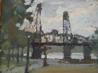
Hawthorne Bridge


Today I biked into town early and did this little sketch before class. The board had another painting on it which I'd sanded down a bit, and it was mostly dark. I started with the dark shapes of the bridge and trees and then cut in the sky and water around them.

Monday, July 12, 2010

Little landscape on the way home


This is on Terwilliger. The road has some beautiful curves and today I had my little paintbox with me, coming back from the first day of the plein-air class downtown. It's six by eight.
Posted by Picasa

Sunday, July 11, 2010

Plein-air Painting Workshops


Here's Gay Pulley's painting from the last day of the Multnomah Village workshop. If you know the village you'll recognize the bento hut across the street from the Arts Center. Interesting challenge to paint bright yellow in shadow. In the light side we used cadmium yellow medium + cad orange + a little white. In the shadow side we started with yellow ochre, added cobalt blue and alizarin crimson, and then some cad yellow until it acquired the proper color identity.

Here are more photos from the July 6-9 class.

I have discovered a new landscape painting book, recently published, written by Mitch Albala (whose work is on display this month at Brian Marki Fine Art on NE Broadway--a good show with Scott Gellatly and another artist). Mitch teaches at the Gage Academy in Seattle. His book is excellent and I highly recommend it: Landscape Painting: Essential Concepts and Techniques for Plein Air and Studio Practice.

And here is a link to an album that includes some of my favorite landscape artists.